Little Island
Design Studio: C&G Partners
Photo Credit: Timothy Schenck
Little Island is a redesigned version of Pier 55, which was damaged by Hurricane Sandy. Barry Diller and the Hudson River Park Trust collaborated on the project, with C&G handling signage and graphics. Heatherwick Studio and Mathews Nielsen Landscape Architects were also part of the team.
Identity, Environmental, Digital, Animation, and Wayfinding Design
Inherited Logo and Logo System
Additional Shapes
When we inherited the brand, we only had the logo to work with. However, we used it as a starting point and source of inspiration for the project. We aimed to create a welcoming and whimsical feel, and instead of seeing the logo as a limitation, we used it as a foundation to build upon. By examining the logo’s shapes and rough edges, we envisioned small islands viewed from a bird’s-eye perspective or Matisse-like shapes. With this in mind, we created additional organic forms that complemented the original shapes.
Color System
Brand System
In addition to incorporating organic shapes, we used Little Island’s main colors as the starting point for our design. We also introduced seasonal colorways, with three colors per season, so that users could mix and match the main colors with seasonal ones. Using a simple formula, we were able to rotate and scale the shapes to create a dynamic layout that can be easily generated on any application.
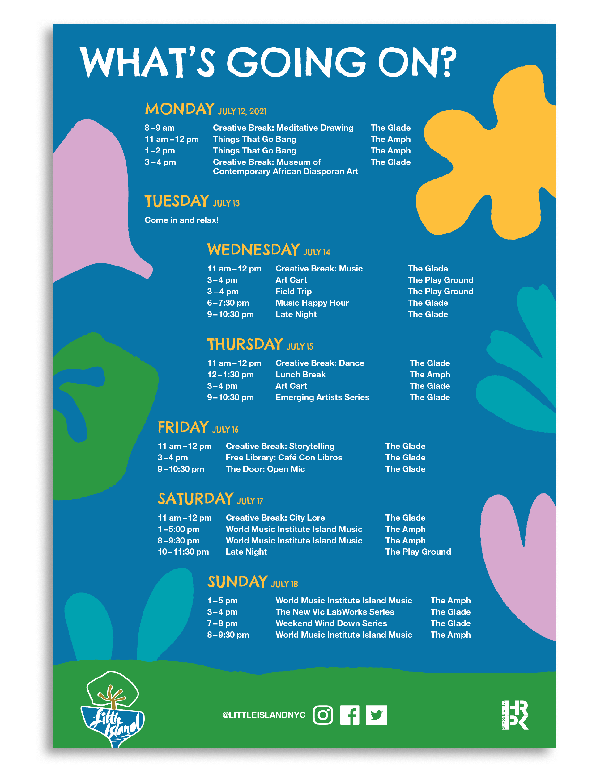
Poster
Little Island’s wayfinding system guides visitors through the park’s undulating landscape. The signs and cabinets blend in with the environment by using similar materials found throughout the man-made park.
Poster System
Our poster systems are intended to showcase the harmony of all graphical elements. To achieve this, we included a bottom shape that echoes the water of the shore or the rolling hills of the park, and added bands that can be used to divide content and information.
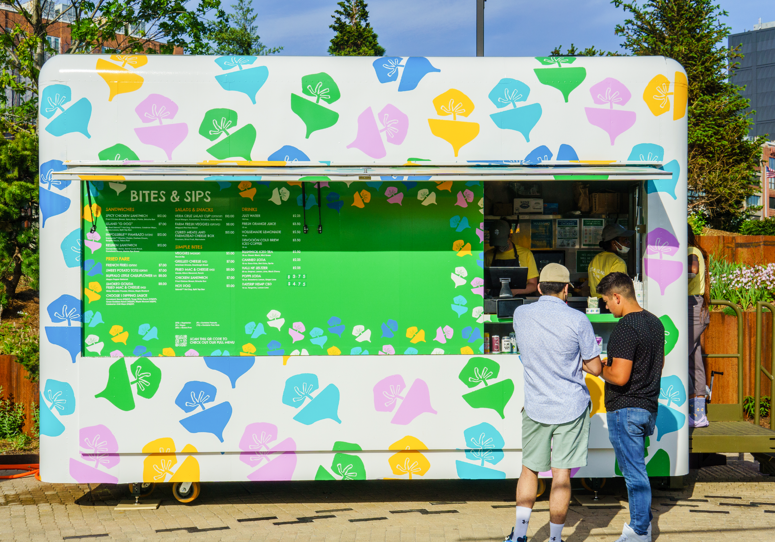
Street Truck Graphic Wrap
Manhole Cover
We integrated various other design elements, including playful confetti-like logos and topographical lines inspired by the park’s natural features. These additional elements added another layer of visual interest, providing users with more tools to help grow their brand.
Map
We created multiple video game-like maps with a focus on simplicity that harmoniously incorporating many of our brand’s elements.


